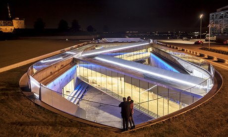
What do you do if you want to design an iconic building – a concept which for at least a decade has been declared terminally ill – that is not an icon? What if you are Bjarke Ingels, a walking whoosh of brilliance, ambition and salesmanship dulled only very slightly by near-permanent jet lag, who is currently sweeping the world of architecture in a way few 39-year-olds have managed before? Who, with this project, is returning to his (careful, thoughtful) homeland of Denmark on a site patrolled – as if by cultural drones – not only by history, but also by the greatest work of literature of all time. The answer is a building whose highest point, its glass balustrade, is about a metre off the ground, but which offers underneath a work of infinite jest and most excellent fancy.
The project is the Danish National Maritime Museum, and although it is on a spot surveyed by old fortifications, what makes it keep its head down is not artillery fire, but the fact that this is a Unesco world heritage site. It’s in the town of Helsingør, known to literary Anglophones as Elsinore, and presiding over the scene are the walls and turrets of Kronborg, otherwise known as Hamlet’s castle.
Shakespeare’s use of foreign locations (Illyria, the coast of Bohemia, Bermuda) could be notional, but this wild and whirling promontory plays its part in Hamlet well. It’s easy to think that ghosts and madness lurk in its nipping and eager air, notwithstanding the lugubrious ply of frequent ferries to nearby Sweden. It’s a place of both real potency and ersatz significance – as in the end the connection to the Bard is somewhat arbitrary.

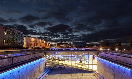
‘Ramped, zigzagging bridges encourage visitors to descend in moderate haste.’
It’s an interesting site for an architect who has chosen to call his practice BIG (as in Bjarke Ingels Group), which gives its Danish website the name www.big.dk. If a £34m cultural landmark would be an all-consuming, career-defining, once-in-a-lifetime opportunity for most architects of Ingels’s age, this is almost toy-like compared with the mountain-like blocks of flats he has already built on the edge of Copenhagen, and the 450ft pyramid he has under way on West 57th St, Manhattan… or the 500-metre-plus tower he has designed in Tianjin, China. With this museum he is getting himself to a nunnery.
The original intention for the museum was to fill a 1950s concrete dock, drained of water, but BIG pointed out that it would be more interesting to leave the dock open as far as possible, with the new galleries wrapped around it in subterranean chambers. Interesting, if complicated, as the structure is not only underground but also, being next to the sea, in effect underwater. A triple layer of concrete and steel has to deal with this perilous circumstance, a job that the old dock wall might otherwise have done until doomsday. Also, because the air-filled void would now be buoyant, steel anchor rods had to be screwed into the ground to prevent a strange eruption of the whole building.
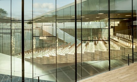
As a result, the dock now works well as a hole to keep the wind away. Bounded in this concrete nutshell, what’s more, you find the necessary architectural dazzle. Ramped, zigzagging bridges encourage visitors to descend in moderate haste, first from ground level to the entrance, then through light-filled short cuts between the black-box galleries that ring the outer perimeter. One contains the banked seats of an auditorium, with a stage for lecturers sloping the other way – which, unusually, is given as much floor area as the audience have. It promises to make talks on maritime history into a kind of performance art, albeit one viewed from some odd angles in certain seats – north-west-by-west, upskirt, neck-cricking.

An auditorium ‘promises to make talks on maritime history into a kind of performance art’.
As you look along the dock from one glass-and-aluminium bridge to another, their reflections and transparencies turn them into objects of infinite space, their layering of multiple uses – circulation, exhibition, auditorium – a combination and a form indebted to Ingels’s former employer, Rem Koolhaas. The contrast of the shiny new stuff with the harsh world of the existing structure is made as strong as possible, and where repairs to the old concrete were required the contractors were instructed to rough-hew them how they wanted. The bottom of the dock, a hoped-for public space of unusual properties, is rough and brusque: steel cylinders, the termini of the 40-metre bodkins going deep into the ground, prod upwards unceremoniously.
This is partly a consequence of money running out, but also part of the Ingels aesthetic. The soul of BIG’s wit is brevity, and you could explain their design concepts between two floors on an elevator ride – it’s a mountain of flats; it’s a ramp for bicycles rising 10 storeys in the air (which is what their “8 House” apartment block in Copenhagan is); it’s a zigzag in a hole. BIG is less concerned with the endless iteration of designing details or making the project thick with thought. They don’t aim to control every surface. It’s not that they can’t be bothered (I spent a long time with the project architect, Jeppe Ecklon, who has spent years of grunt and sweat on getting the museum more or less as BIG wanted), but they are not greatly interested in perfection.

Photograph: BIG
The result is not resonant. Elsewhere in Elsinore time has given smoothness to unalike substances, such as stone, wood, iron and turf, next to which BIG’s brittle surfaces are jangled, out of tune and harsh. I would prefer a metal more attractive than aluminium, or possibly not metal at all. However, the big move – the diagonals taking you down into the undiscovered country of the old dock – is as apposite as it is bold. It is supported by other moments of invention, such as apparently simple staircases that turn out to descend at different pitches, depending on which side of their broad width you are using. It is not supported, on the other hand, by the exhibition design, by the Dutch company Kossmann.dejong, which feels the need to offer sounds and film of the sea, in case you had forgotten what it is, and which undermines the purposeful perfection of maritime equipment with mannered, angular cases. A wise man has called such desperate appliances, which pre-empt the work of the imagination, “pre-chewed food”.
As Ecklon says, BIG can be rude because so much Danish culture is gentle and civil. If all Danes were like these architects, the country would be unbearable. But there is method in BIG’s badness, as – no matter how wayward their projects might look – there is an intelligence behind their moves. A work like the 8 House, a vast ziggurat-hive, looks horrifying at a distance, but closer-to it has surprising intimacy and richness. And the maritime museum, if I might quote Shakespeare for a moment, is a goodly frame.
//KOMENTAR ANDA
